A colleague recently presented the results of a survey we designed. Instead of a table with means, standard deviations, t statistics and p values I thought a series of dotcharts with error bars would be more appropriate and convey the required information in a more engaging manner. It wasn’t as straight forward as I thought it should be to make such plots comparing the results of different surveys, so I’m sharing my code.
Some difficulties I ran into:
– reordering the categories on the y axis (default is alphabetical order, which is fine when they’re called “Survey 1”, “Survey 2” and “Survey 3” but not so good with more meaningful labels).
– changing the text size, lattice graphics have some peculiar syntax compared with base or ggplot2
– getting the bars (with tips) to work nicely
– adjusting the spacing so that the top and bottom surveys weren’t so close to the edge of the plot
– labelling the x axis nicely
– lattice graphics require the print function wrapper when called in a loop
mypanel.Dotplot <- function(x, y, ...) {
panel.Dotplot(x,y,...)
tips = attr(x, "other")
panel.arrows(x0 = tips[,1], y0 = y,
x1 = tips[,2], y1 = y,
length = 0.05, unit = "native",
angle = 90, code = 3,lwd=2,col="blue")
}
library(Hmisc)
dcfn = function(means,sds,n,title){
data = data.frame(ID=factor(c("Survey 1","Survey 2","Survey 3")),
means=means,
stderrs=2*sds/sqrt(n))
data$lower = data$means-data$stderrs
data$upper = data$means+data$stderrs
Dotplot(data$ID ~ Cbind(data$means,data$lower,data$upper),
col="blue", pch=20, panel = mypanel.Dotplot, ylim=c(0.5,3.5),
xlab=list("",cex=1.5),
ylab=list("",cex=1.5),xlim=c(-0.5,10.5),
cex=2,
scales=list(y=list(cex=1.5, at=1:3,
# for reordering the y labels:
labels=levels(data$ID)[ c(1,3,2) ])),
x = list(cex=1.5,at=c(0,5,10),
labels=c("0nNo knowledge","5nModerate knowledge",
"10nFull knowledge")),
main=list(title,cex=1.5))
}
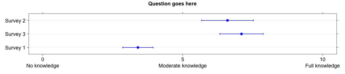
n = c(107,45,54)
means = c(3.4,7.1,6.6)
sds = c(2.8,2.6,3.4)
png("dotchart.png",width=1200,height=260)
dcfn(means,sds,n=n,title="Question goes here")
dev.off()
# if using a loop you'll need to use the print function:
# print(dcfn(means[i,],sds[i,],n=n,title=titles[i]))
The result: